

Capturing family beach photos that look cohesive, vibrant, and timeless starts long before you even arrive at the sand. One of the most critical elements is choosing the right family beach photo color schemes. Colors can make or break a photo—they influence the mood, ensure every family member stands out, and create a visually balanced image that will look great for years to come.
Whether you are planning a professional photoshoot or a casual family outing, understanding color coordination, complementary tones, and how your outfits interact with the beach environment is essential. In this guide, we’ll explore everything you need to know about selecting the perfect family beach photo color schemes, from wardrobe ideas to color theory tips, and even seasonal adjustments.
Why Choosing the Right Color Scheme Matters for Family Beach Photos
Choosing the right color scheme for your family beach photos is not just about aesthetics—it’s about creating a harmonious, visually appealing image that tells a story. The colors you pick influence not only how your family looks together but also how the beach background interacts with your outfits. Here’s why color matters:
The Impact of Colors on Photos
- Mood and emotion: Colors evoke emotions. Soft pastels create a calm and airy feel, while bright tones like coral and turquoise create energy and vibrancy.
- Focus on subjects: Well-chosen colors make family members stand out against the sand and ocean without clashing or blending in. For instance, wearing all beige on a sandy beach can cause your family to appear “washed out,” while complementary colors help everyone pop.
- Timelessness: Classic combinations like neutrals or soft blues can give your photos a timeless appeal, making them look beautiful decades later.
How Colors Affect Storytelling
Color can subtly tell a story in your photos. For example:
- Matching pastel outfits can communicate unity and serenity.
- Bright and bold combinations convey a fun, playful family dynamic.
- Seasonal hues—like warm oranges in fall or tropical blues in summer—can reflect the environment and create a sense of time and place.
Tips for Making Your Family Photos Timeless
- Stick to 3–4 main colors to keep your photos visually balanced.
- Avoid trendy colors that may look outdated in a few years; instead, choose classic tones that are flattering on all skin types.
- Consider natural textures and fabrics like linen, cotton, and soft knits—they complement the beach environment beautifully.
Pro Tip: If you are unsure, bring multiple outfits or layers so your photographer can experiment with different family beach photo color schemes to find the perfect combination for your group.
Popular Family Beach Photo Color Schemes
Choosing the right family beach photo color schemes starts with understanding the most popular and photogenic palettes. The goal is to create harmony between your outfits, the beach environment, and the natural lighting. Here’s a detailed look at different color schemes that consistently produce stunning results:
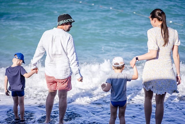
Neutral Tones (White, Beige, Sand)
Neutral tones are a timeless choice for family beach photos. They create a clean, soft, and elegant look that works in nearly any beach setting.
Why neutrals work well on the beach:
- Sand and water naturally complement neutral shades, creating a seamless and airy feel.
- Neutral colors do not distract from facial expressions and natural interactions.
- They pair easily with subtle accessories like straw hats, belts, or pastel scarves.
Outfit Ideas for Families:
| Family Member | Outfit Idea |
| Adults | White linen shirt with beige shorts or pants |
| Kids | Soft cream dresses or light khaki shorts and tops |
| Accessories | Straw hats, light scarves, and soft sandals |
Pro Tip: Use neutrals as a base, then add small pops of color with accessories to give dimension to your photos.
Pastel Colors (Soft Pink, Baby Blue, Mint)
Pastels are soft, calming, and photogenic. They create a dreamy effect, especially during sunrise or sunset.
Benefits of pastels in beach photos:
- Complement the natural tones of sand and sea without clashing.
- Perfect for creating a cohesive family look without being overly matchy.
- Work beautifully for children’s outfits, giving a whimsical, playful feel.
Matching Pastel Outfit Ideas:
- Mom: Light pink sundress
- Dad: Baby blue linen shirt with white pants
- Children: Mint or lavender dresses, soft pastel shorts with simple white tops
Fun Fact: Pastel colors reduce glare in photography and tend to photograph well even in bright sunlight.
Bright and Bold Colors (Coral, Turquoise, Yellow)
Bright colors inject energy into your photos and are perfect for summer or tropical beaches.
Tips for using bold colors:
- Avoid overloading the palette; stick to 1–2 bold shades per family member.
- Pair bright outfits with neutral or pastel tones to prevent visual chaos.
- Consider the background: turquoise water or golden sand can enhance complementary colors like coral and yellow.
Example Combinations:
- Dad: Turquoise polo
- Mom: Coral maxi dress
- Kids: Yellow sundress or coral shirt with white shorts
Pro Tip: Bright colors are ideal for families who want fun, lively, and playful beach portraits.
Monochromatic Color Schemes
A monochromatic palette uses different shades of a single color to create harmony and simplicity.
Benefits:
- Creates a sleek, modern, and cohesive look.
- Easier to coordinate across multiple family members.
- Works well with neutral backgrounds like sandy beaches.
Ideas:
- Shades of blue: Navy, sky blue, light aqua
- Shades of beige: Tan, cream, off-white
Pro Tip: Mix textures and fabrics to add depth when sticking to one color, like linen, knit, or cotton.
Seasonal Color Schemes
The season can influence the best color choices for family beach photo color schemes.
Summer: Vibrant tropical hues (coral, turquoise, yellow)
Spring: Soft, airy tones (pastels like pink, mint, lavender)
Fall: Warm, earthy shades (rust, mustard, olive)
Winter: Cool, muted tones (navy, grey, soft white)
Pro Tip: Align your outfits with the season not just for visual appeal, but also to make your photos feel relevant and timeless when displayed in your home.
How to Coordinate Family Outfits for Beach Photos
Coordinating outfits is one of the most important steps in creating beautiful family beach photo color schemes. It’s not about everyone wearing the exact same color; it’s about creating visual harmony while allowing each family member to shine individually.
Matching vs. Complementing Colors
- Matching outfits involve everyone wearing the same color or very similar shades. This can create a clean, uniform look, which works well with neutral tones or monochromatic schemes.
- Complementing colors involve choosing shades that go well together without being identical. For example, pairing soft pink with mint green or coral with turquoise. This approach is perfect for families who want dynamic, visually interesting photos without appearing too “matchy.”
Tip: Pick 2–3 main colors and distribute them across family members. Avoid more than 4 colors to maintain visual cohesion.
Balancing Patterns and Solids
Patterns can add personality and fun to your family beach photos, but too many can be overwhelming.
Guidelines:
- Limit patterns to one or two family members at most.
- Pair patterned items with solid colors from your main palette to create balance.
- Avoid overly small patterns, as they can create a distracting “noise” effect in photos.
Examples:
- Mom wears a subtle floral dress, kids wear solid pastel tops, Dad wears a solid linen shirt in a complementary color.
- One child can wear stripes while the rest of the family sticks to solids from the same color family.
Accessories and Layers that Enhance Color Schemes
Accessories are an easy way to add depth and subtle pops of color:
- Hats: Straw sun hats, pastel caps, or bold fedoras
- Scarves/Shawls: Light fabrics in complementary shades
- Shoes: Neutral sandals, espadrilles, or barefoot for a natural look
- Props: Blankets, beach towels, or small toys in coordinating colors
Pro Tip: Accessories can subtly tie the color scheme together without making outfits appear forced or too “styled.”
Tips for Including Babies and Toddlers in the Color Plan
Young children often have special needs in photos, such as comfort and ease of movement. Here’s how to include them:
- Use soft fabrics and avoid tight clothing that might irritate a baby.
- Consider solid pastel or neutral tones for toddlers, which blend beautifully with most family palettes.
- Small pops of color (like a cute headband, hat, or tiny shoes) can make kids stand out without overpowering the overall color scheme.
Pro Tip: If you’re planning a professional photoshoot, bring an extra outfit or layers for toddlers—they are more likely to spill, get sandy, or get wet, and this ensures your family beach photo color schemes remain consistent throughout the session.
How to Choose the Right Color Scheme Based on Beach Settings
Selecting the perfect family beach photo color schemes isn’t just about favorite colors—it’s also about the environment where your photos are taken. Different beaches, lighting, and water colors can dramatically affect how your outfits look in photos. Here’s a detailed guide to help you choose the best colors for any beach setting.
Sandy Beaches vs. Rocky Beaches
- Sandy Beaches:
- Soft, neutral sand tones pair beautifully with pastels, neutrals, and soft earthy colors.
- Avoid colors that are too similar to the sand (like beige or off-white) unless you plan to add contrast with bold accessories.
- Example: Soft pink dress on mom, baby blue shirt on dad, white shorts for kids.
- Soft, neutral sand tones pair beautifully with pastels, neutrals, and soft earthy colors.
- Rocky Beaches:
- Rocks often have darker, cooler tones. Bold colors like coral, turquoise, or mustard stand out well.
- Earthy tones such as olive or rust can complement natural stone textures.
- Example: Mom in coral sundress, Dad in olive shirt, kids in turquoise or yellow outfits.
- Rocks often have darker, cooler tones. Bold colors like coral, turquoise, or mustard stand out well.
Tropical Beaches vs. Cooler Climates
- Tropical Beaches:
- Bright sunlight enhances vibrant colors, so bold shades like fuchsia, turquoise, or coral can pop beautifully.
- Pastels may appear washed out in direct sunlight, so combine them with whites or neutrals.
- Bright sunlight enhances vibrant colors, so bold shades like fuchsia, turquoise, or coral can pop beautifully.
- Cooler Beaches (Northern or temperate climates):
- Soft neutrals, muted pastels, or deep jewel tones like navy and maroon work better.
- Layers such as light sweaters or shawls add warmth and texture without clashing with the scenery.
- Soft neutrals, muted pastels, or deep jewel tones like navy and maroon work better.
Sunrise vs. Sunset Photo Color Considerations
- Sunrise:
- Cooler, softer tones like lavender, pale pink, mint, or soft grey work well.
- Avoid overly dark shades, which can look heavy against the soft morning light.
- Cooler, softer tones like lavender, pale pink, mint, or soft grey work well.
- Sunset:
- Warm hues like coral, peach, gold, and mustard enhance the golden hour glow.
- Neutral tones also look beautiful, reflecting the soft orange and pink light.
- Warm hues like coral, peach, gold, and mustard enhance the golden hour glow.
Water Color Impact: Blue Ocean vs. Green Sea
- Blue Ocean Beaches:
- Whites, blues, corals, and pastels look striking against deep blue waters.
- Avoid greens that might blend too much with the water.
- Whites, blues, corals, and pastels look striking against deep blue waters.
- Green or Turquoise Water Beaches:
- Coral, pink, and yellow outfits create a vibrant contrast.
- Soft neutrals like white or beige can help balance bold colors and prevent the photo from looking too busy.
- Coral, pink, and yellow outfits create a vibrant contrast.
Pro Tip: Before your photoshoot, take a quick test photo with your chosen outfits against the beach background. This ensures that your family beach photo color schemes pop in natural light and complement the setting perfectly.
How to Use Color Theory for Family Beach Photos
Understanding color theory can elevate your family beach photo color schemes from good to stunning. Color theory helps you combine hues in ways that are visually appealing and harmonious, ensuring that your photos feel balanced and professional. Here’s a deep dive into how to apply it.
Complementary Colors
- Definition: Colors directly opposite each other on the color wheel (e.g., blue and orange, coral and turquoise).
- Why it works for beach photos: Complementary colors create a striking contrast that makes subjects stand out while maintaining visual harmony.
- Example:
- Mom: Coral dress
- Dad: Teal shirt
- Kids: Neutral outfits like white or beige to tie the look together
- Mom: Coral dress
- Pro Tip: Use one color as the dominant shade and the other as an accent to avoid overpowering the photo.
Analogous Color Combinations
- Definition: Colors that are next to each other on the color wheel (e.g., blue, turquoise, and green).
- Why it works: Creates a soft, cohesive palette that feels natural and calming, perfect for pastel and neutral family beach photo color schemes.
- Example:
- Mom: Soft mint dress
- Dad: Baby blue shirt
- Kids: Light green tops or dresses
- Mom: Soft mint dress
- Pro Tip: Analogous schemes work beautifully in sunrise or soft light settings, giving photos a serene and cohesive feel.
Triadic Color Schemes for Vibrant Family Photos
- Definition: Three colors evenly spaced on the color wheel (e.g., coral, turquoise, and yellow).
- Why it works: Triadic schemes are bold and lively, giving photos a fun and playful energy without clashing.
- Example:
- Mom: Coral sundress
- Dad: Turquoise shirt
- Kids: Yellow or pastel accent pieces
- Mom: Coral sundress
- Pro Tip: Balance triadic schemes by using one dominant color and smaller amounts of the other two to prevent visual chaos.
Avoiding Colors That Clash or Distract
- Colors that are too similar to the beach environment can “disappear” in photos (e.g., beige on sandy beaches).
- Overly bright neon shades can distract from the subjects and appear unnatural.
- Avoid mixing too many different hues; stick to 3–4 main colors for cohesion.
Practical Tip: Create a Color Palette Board
- Use Pinterest, Canva, or even a simple mood board to visualize your family beach photo color schemes before the shoot.
- Include outfit swatches, beach backgrounds, and lighting conditions to ensure harmony.
- This makes coordinating multiple family members much easier and helps avoid last-minute outfit clashes.
Quote: “Color is a power which directly influences the soul.” – Wassily Kandinsky
Using thoughtful color combinations in your family beach photos creates not just beautiful pictures, but emotionally resonant images you’ll treasure for years.
Photography Tips to Make Your Color Scheme Pop
Even with perfectly coordinated family beach photo color schemes, the way you capture the photo can make all the difference. Photography techniques, lighting, and small props can enhance your colors and make your family photos truly standout. Here’s a detailed guide:
Lighting Considerations for Beach Photos
- Golden Hour (Sunrise & Sunset): Soft, warm lighting enhances pastels, neutrals, and warm tones like coral or peach. Avoid harsh midday sun, which can create shadows and wash out colors.
- Cloudy or Overcast Days: Diffused light softens colors, making muted and neutral tones look rich. Bold colors also stand out more against gray skies.
- Backlighting: Placing the sun behind your subjects creates a glowing effect around them. This works especially well with light-colored outfits, adding depth to your photos.
Pro Tip: Always check your lighting conditions and plan your photoshoot accordingly to ensure your family beach photo color schemes appear vibrant and natural.
Camera Settings for Capturing True Colors
- White Balance: Adjust your camera’s white balance to match the light conditions (sunny, cloudy, shade) to prevent colors from looking unnatural.
- Exposure: Slightly underexpose photos to preserve bright colors like coral, turquoise, or yellow.
- Focus & Depth of Field: Use a wide aperture (f/2.8–f/4) to blur the background and make your family stand out. This emphasizes colors in the outfits while softening the beach background.
Post-Processing Tips: Enhancing Colors Without Overdoing It
- Adjust saturation and contrast carefully—too much can make colors look artificial.
- Slightly increase warmth for golden hour photos to enhance pastels and neutrals.
- Use selective color adjustment to make one or two colors pop without affecting the entire image.
- Keep skin tones natural—your outfits should shine without overpowering your family members.
Pro Tip: Use programs like Adobe Lightroom or mobile apps like Snapseed to make subtle adjustments that enhance your chosen family beach photo color schemes.
Using Natural Props to Complement Your Color Scheme
Props can reinforce your chosen colors and make your photos feel more cohesive:
- Blankets or picnic mats: Match or complement your color palette.
- Beach toys or small decor: Shells, buckets, or surfboards can add subtle pops of color.
- Flowers or greenery: Can be used as accent pieces for pastel or neutral outfits.
Example: If your color scheme includes soft pastels, use a light pink blanket and mint-colored beach bucket to tie everything together visually.
Additional Tips
- Encourage movement: Running, jumping, or playful interactions make colors appear more dynamic.
- Layering fabrics: Flowy dresses or light scarves catch the wind and add depth to photos.
- Avoid too much sand or water splashing on vibrant colors unless you want a natural, candid look.
Fact: Studies in photography psychology show that photos with well-coordinated colors and strong contrasts draw attention faster and hold viewer interest longer.
Common Mistakes to Avoid with Family Beach Photo Color Schemes
Even with careful planning, families sometimes make mistakes that affect the overall look of their beach photos. Knowing what to avoid ensures that your family beach photo color schemes look polished, harmonious, and timeless.
Overmatching Outfits
- While matching outfits can look neat, too much uniformity can make photos appear staged or unnatural.
- Avoid dressing everyone in the exact same shade from head to toe. Instead, mix complementary tones, neutrals, or subtle patterns to maintain visual interest.
Tip: Use one or two matching colors as anchors and let other family members wear complementary shades.
Wearing Colors That Blend Into the Background
- Light beige, pale yellow, or sandy colors can easily blend into the sand, making subjects less noticeable.
- Similarly, greens can get lost if the backdrop includes seaweed, dunes, or tropical foliage.
Solution: Always test your outfits against the beach background before your shoot and add a contrasting color or accessory if necessary.
Ignoring the Environment and Lighting
- Colors that look great indoors may appear washed out or overly bright on the beach due to natural light.
- Bright midday sunlight can blow out whites or pastels, while sunset light can make some bold colors look muted.
Tip: Adjust your color choices based on the season, time of day, and type of beach environment (sandy, rocky, tropical, etc.).
Choosing Trendy Colors Over Timeless Combinations
- Trends come and go. Neon or ultra-bright tones may look fun today but could make your photos feel dated in a few years.
- Classic colors like soft pastels, neutrals, and balanced bolds ensure your photos remain timeless.
Pro Tip: Mix subtle trendy accents (like accessories) with classic color schemes to keep your photos fresh without sacrificing longevity.
Neglecting Kids’ Comfort and Fit
- Outfits that are uncomfortable or restrictive can result in fussy children, which affects the flow and natural interactions in your photos.
- Opt for soft fabrics, breathable materials, and practical shoes that match the color scheme but allow freedom of movement.
Quick Fact: Children who are comfortable in their outfits tend to have more natural smiles, making your family beach photos look lively and authentic.
Creative Ideas and Inspiration for Family Beach Photo Color Schemes
Planning your family beach photo color schemes can be fun and creative. Inspiration can come from trending ideas, famous photography styles, or playful themes that reflect your family’s personality. Here’s a comprehensive guide to spark creativity:
Pinterest and Instagram Trends
- Social media platforms are goldmines for fresh ideas:
- Pastel palettes: Soft pinks, blues, and mint continue to trend for dreamy, airy beach photos.
- Neutral minimalism: White, beige, and sand tones create timeless, elegant visuals.
- Vibrant tropical vibes: Bold coral, turquoise, and yellow pops are perfect for energetic summer sessions.
- Pastel palettes: Soft pinks, blues, and mint continue to trend for dreamy, airy beach photos.
- Tip: Create a Pinterest board with 20–30 images to visualize your color scheme, outfit coordination, and beach settings.
Famous Family Beach Photo Examples
- Look at celebrity family photos or professional photography portfolios:
- The Kardashian family often uses neutral tones for cohesive, polished looks.
- Coastal lifestyle photographers showcase triadic color schemes for playful and vibrant shots.
- The Kardashian family often uses neutral tones for cohesive, polished looks.
- Analyze these photos for inspiration on outfits, props, and composition without directly copying.
DIY Props to Enhance Color Coordination
Props can help tie your family beach photo color schemes together:
- Beach blankets and towels: Choose colors that complement your outfits.
- Beach balls or surfboards: Add playful pops of color for kids’ energy and fun.
- Baskets and picnic items: Natural textures like wicker or wood match neutral palettes.
- Flowers or greenery: Subtle pastel flowers can enhance soft color schemes.
Tip: Even small props like matching sunglasses or hats can elevate the overall visual harmony of your photos.
Themes: Nautical, Tropical, Boho, or Minimal
- Nautical: Blue, white, red; ideal for classic, crisp visuals.
- Tropical: Bright coral, turquoise, green; perfect for vibrant summer sessions.
- Boho: Earthy tones, creams, soft pinks, layered textures; creates a relaxed, artsy vibe.
- Minimal: White, beige, soft neutrals; timeless and elegant with a focus on natural beauty.
Pro Tip: Choosing a theme helps guide your outfit selection, props, and overall family beach photo color schemes, making the planning process easier and more cohesive.
Using Mood Boards for Inspiration
- Combine outfit swatches, beach photos, and props in a single board.
- Helps visualize the final look, ensuring all colors and patterns harmonize.
- Useful when communicating your vision with photographers.
Fact: Studies show that creating visual boards for photography projects reduces decision fatigue and increases satisfaction with final images.
FAQs About Family Beach Photo Color Schemes
Families often have lots of questions when planning their family beach photo color schemes. Here are answers to some of the most common concerns, providing practical guidance for a successful beach photoshoot:
What are the best colors for family beach photos?
- Neutrals: White, beige, soft grey – timeless and elegant.
- Pastels: Baby blue, mint, soft pink – create a dreamy, airy vibe.
- Bold colors: Coral, turquoise, yellow – add energy and fun.
- Tip: Choose colors that complement the beach environment and your family’s skin tones.
How many colors should I include in family outfits?
- Stick to 3–4 main colors to maintain harmony.
- Include one dominant color and one or two accent colors across family members.
- Avoid using too many colors, as it can make the photos look busy and chaotic.
Can kids wear patterns without clashing?
- Yes! But keep patterns limited to one or two family members.
- Pair patterned outfits with solid colors from the same color palette.
- Simple stripes, small florals, or subtle polka dots work best.
Do color schemes differ for professional vs. casual beach photos?
- Professional photos: Stick to cohesive, harmonious color schemes for timeless, polished results.
- Casual photos: More flexibility to mix patterns, playful colors, and props while maintaining some coordination.
- Tip: Even casual family photos benefit from thinking about complementary colors and avoiding clashes.
How can I make my family photos look cohesive but not too “matchy”?
- Use complementary or analogous color combinations instead of everyone wearing the same shade.
- Mix textures, patterns, and layers to add dimension.
- Include small pops of color through accessories, props, or subtle accents in clothing.
Are there color choices to avoid for beach photos?
- Colors that blend into the sand or environment (like beige on sandy beaches or green in tropical foliage).
- Overly neon shades that can distract from the subjects.
- Dark or heavy tones that may appear harsh in bright sunlight.
Pro Tip: Test your outfits against the beach backdrop before the shoot to ensure your family beach photo color schemes work in real lighting conditions.
Conclusion: Choosing the Perfect Family Beach Photo Color Scheme
Creating stunning family beach photo color schemes takes planning, creativity, and a little knowledge of color theory. By thoughtfully selecting colors that complement each other, the beach environment, and your family’s personalities, you can capture photos that are vibrant, cohesive, and timeless.
Key Takeaways:
- Start with a base palette: Neutrals, pastels, or bold tones depending on your style and environment.
- Coordinate, don’t match: Mix complementary or analogous colors to create harmony without looking uniform.
- Consider the beach setting: Adjust colors based on sand, water, rocks, and lighting conditions (sunrise, sunset, or midday).
- Use color theory wisely: Complementary, analogous, and triadic schemes help create visually appealing photos.
- Pay attention to details: Accessories, props, and textures can elevate your outfits and reinforce the color scheme.
- Avoid common mistakes: Overmatching, blending into the background, ignoring lighting, and relying on trendy colors.
- Seek inspiration: Pinterest boards, Instagram trends, and famous family photos can help spark ideas.
Final Tip: Always test your outfits and props with a few trial shots before the full photoshoot. This ensures your chosen family beach photo color schemes work beautifully in real-life conditions and that your photos will be cohesive, balanced, and visually stunning.
By following these strategies, your family beach photos will not only look professional and polished but also tell a story of connection, fun, and timeless memories. Thoughtful planning of your family beach photo color schemes ensures that your photos remain a cherished part of your family’s legacy for years to come.